
Options Strategy – Volatility
Video Tutorial
In this section of beeTrader the Chain Options acquired are often used as illustrated in the section Volatility Surface . Therefore, it is advisable to carry out the acquisition before proceeding with the analyzes below.
Volatility Index
Introduction: the beeTrader Volatility Index represents the average volatility of the entire surface on all maturities, i.e. all OTM, ATM, ITM options listed on all available maturities.
To complete the volatility analysis we have the Volatility Finder which analyzes the implied volatility of ATM options.
The beeTrader Volatility Index has a proprietary calculation mode that differs from how the other indices are calculated and therefore absolutely not COMPARABLE measures .
We devised this algorithm because there was no Volatility Index that indicated not so much the implied volatility that I already find in the other indices, but gave an indication (Index) of the probable trajectory of the underlying. We have extended it to all the instruments dealt with and you can find it on stocks, currencies, futures and bonds.
Use : beeTrader’s Volatility Index is used both to evaluate the trend and to identify the period of rising or falling volatility. There are two display modes which are:

Difference
This method allows the assessment of the difference between the Volatility Index and the historical volatility of the security with reference to 30,50,75,100,150 periods, or the difference of each individual historical volatility with another of a different period.
The analysis with the Volatility Index is important to be able to define if the Market Maker is pricing risk (implied volatility) greater or lesser than the historical volatility and therefore we know if we will be dealing with discount or increased options.
The analysis of historical volatility is instead important to understand the trend and the level of value of historical volatility.
In the example the difference between the Volatility Index (selected in the Reference to Compare menu) is displayed with the historical volatilities at 30 days and 50 days displayed in the upper graph.

Oscillator
The Volatility Index can also be displayed as an oscillator, this type of display makes it easier to read and consequently decide whether you are in high or low volatility.
Consider the empty spaces left by the indicator as shown and in this way you will avoid many false signals.
Given that you are creating a volatility-trend relationship, you need to understand that it will be long-term and not for daily trading. It takes up position and is maintained until the opposite signal.
An example of using the volatility index oscillator is the one shown in the image.
Options Smile

Options Smile shows the volatility smiles of the call and put options of the surface stored for the underlying, in this regard the date to which the displayed smileys refer is indicated. If no curve is present it is necessary to acquire a surface using the Volatility Surface tool accessible from the menu.
Skewness
How high is the listed risk?
The term Skewness means asymmetry and, if this is applied to options, it means the difference in implied volatility of the Call reference option compared to the Put reference option.
The reference options are those that have a delta equal to 0.25 and with a simple subtraction from the value of the implied Put volatility with respect to the Call reference one, a value is obtained that precisely indicates the slope of the price. The value obtained is always negative in asset stocks and their indices, while it is positive in currencies, bonds and commodities.In fact, Skewness measures the difference in risk that exists between the sample Put and the sample Call and, as is well known, the market prices more risk against the downtrend than agains the uptrend, apart from the currencies, bonds and commodities whose risk is quoted more towards high values.In general, assuming to analyze the FTSE MIB40 index, the higher the number in absolute value of the slope, the more we will expect a drop in prices.

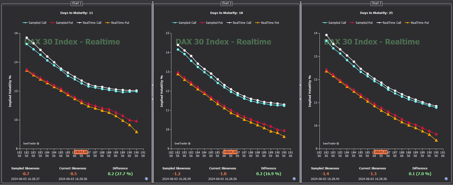
The tool expects to be able to view three deadlines at the same time that can be selected from the appropriate boxes or with the right mouse button.
Inclined half-lines that connect the two sample strikes will be displayed, highlighting the volatility value and, in the labels, the strike value. Finally, a vertical line will be displayed indicating the current value of the underlying. It is possible to capture the image and the volatility values at a given time and view the captured situation with respect to the current situation, thus being able to evaluate variations in the skewness pricing and the consequent probable trend variations. The captured values will take on a different color and will be drawn with dashed lines.It is possible to save the values and recall them for comparison at later times.
Suppose we are in a phase in which the market goes down and we want to know if it is a priced downtrend at a greater risk than the one in which the downtrend was priced in the Covid period of 2020.

NOTE: skewness values are random and are not real values.
In the image, the dashed white half-line that has values 31 and 26.3 is the one called Covid 2020 and is compared with the yellow one with values 25.3 and 24.1 which is that of the FTSE MIB40 today.The difference is 3.5 points, 300% precisely.
Skewness by Strike
In this tab it is possible to view the Call and Put options implied volatilities calculated in real-time at the expiries selected in the main menu. The same considerations made for the Skewness tab apply also to this one.
Cone & Probability

- The table corresponding to the number 1, calculated using the daily bars shown in the chart corresponding to the number 2, shows how much the historical movement of the underlying was when a certain number of days were missing. So if I read on the X24 axis and then I go to the 3% box I read 70, this means that the underlying when it was 24 days to expiry has made a movement of 3% in 70% of the time. With such information I can think of constructing a figure whose gain derives from the exceeding of the strikes. In detail, on the left edge of the table there are the days relating to the available deadlines. In our case, today, we have deadlines of 24, 59, 87, 150, etc. days). In the top row of the table we find pre-set values of% price deviation (1.5 / 2 / 2.5 / 3 / etc), on the basis of which the calculations we find in the colored boxes are made. In the boxes in red the internal number expresses the times in which the displacement was less than 50%, in yellow the times in which the displacement is between 50% and 75% and in green the times in which the displacement was greater than 75%.
- Selecting a row on graph 1, in graph 2 (the historical graph of the title) horizontal lines appear. The red lines identify a possible strangle sold, the green lines a possible strangle bought, the distances from the ATM of the strikes that make up the strangles are indicated under the historical graph.
- Graph 3 displays the volatility cone: it is a tool with which the historical volatility of the underlying is compared with the implicit one for the various strikes and expiries. The cone is built using all available expiries, the historical volatility of all the points is used and then the average is drawn for a year drawn with the blue line. Once the average is obtained, the standard deviations are always calculated at one year, in orange 1 stdev and in green 2 stdev. Implied volatilities for each maturity are represented with dots for calls and with triangles for put. The result is being able to verify the implied volatilities that are inside the cone that have normal values, while those outside the cone have high or low implied volatility values depending on whether they are above or below the cone.
Vega IN / OUT

Vega IN / OUT was designed and developed to take advantage of the retracements from the volatility peaks identified by Volatility Index.
In the literature we read that volatility is sold when it is high and bought when it is low. But this information causes heavy losses. In reality, volatility is sold when it folds down and bought when it is going up. It may seem like a small difference, but it is substantial. This highlights the Vega IN / OUT tool!
An example of use is to exploit the volatility peaks to sell a Straddle when the Volatility Index crosses down the 2 line, so when it is returning from a very high volatility. In this case we try to sell Call and Put on a deadline (1.5 – 2 years) with a low delta, around 0.2. In doing so the figure will be little influenced by the movements of the underlying and will draw its gain from the lowering of the vega.
In the event that the underlying moves a lot and therefore unbalances the delta, thus negating the gain given by the vega, it may make sense to intervene on the delta by unbalancing the figure, then selling another option (Call or Put depending on the direction had of the underlying). In this way the figure will be unbalanced because there will be more contracts sold on one side, but the delta will be balanced.
A level to which balancing can be done is to wait for the ratio between the loss of one side / the gain of the other side to be = 2.