
Options Portfolio – Cash Flow / Risk
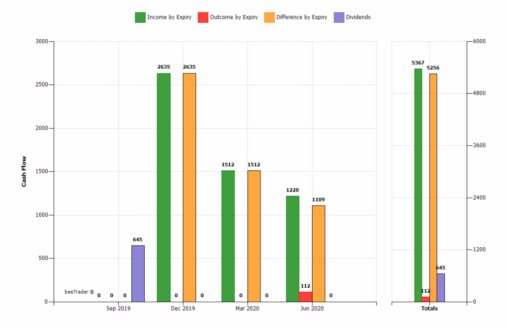
Cash Flow:
histogram chart showing the sum of the collected premiums, the prizes spent and the relative difference of the strategies in the portfolio. On the left the prizes for each deadline (in the case in the example are December 2018), on the right the total sum.
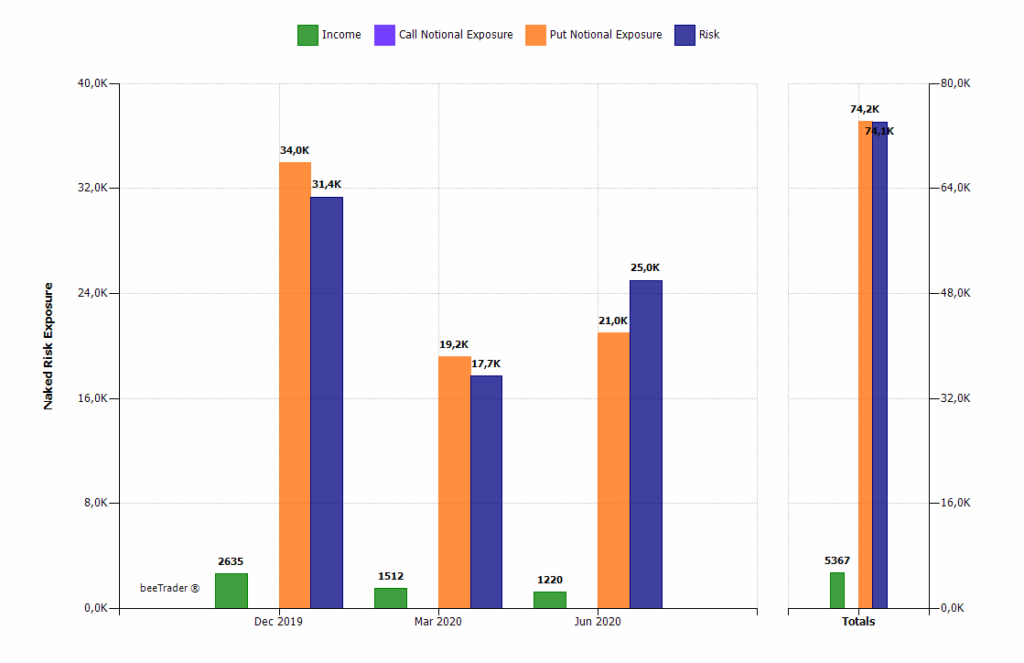
Exposure & Risk (by Expiry):
histogram chart that displays, for each expiry, the collected premiums (Income), the notional exposure of the Call options, the notional exposure of the Put options, and the risk. This risk is calculated as the maximum risk of the strategy if it is not infinite, or maximum risk calculated with the montecarlo simulation (in this case the histogram becomes blurred).
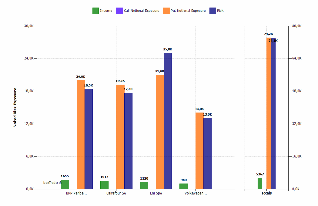
Exposure & Risk (by Underlying):
histogram chart that displays, for each underlying, the premiums received (Income), the notional exposure of the Call options, the notional exposure of the Put options, and the risk. This risk is calculated as the maximum risk of the strategy if it is not infinite, or maximum risk calculated with the montecarlo simulation (in this case the histogram becomes blurred).
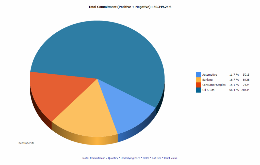
Commitment Sectors:
pie chart that represents the commitment of the portfolio divided by sector of belonging of the underlying.
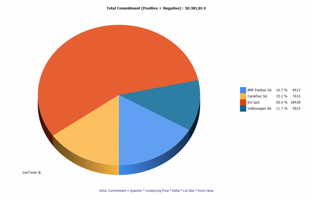
Commitment Underlying:
pie chart that represents the commitment of the portfolio divided by underlying.
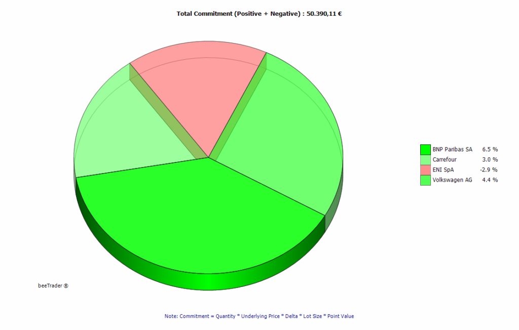
Commitment Performance:
pie chart representing the portfolio commitment divided by strategy. The coloring of the sectors is attributed based on the At Now % value, which is the ratio between At Now and Max Profit of the strategy. Green therefore means that the at now value is close to the max profit, red that the at now value is very far from the max profit. Between the two extreme values the other strategies are colored in order to have an immediate perception of which strategies are performing well and which are not.