
Options Strategy – Charts
Video Tutorial
Payoff
This example shows the display of the payoff with the legs that make it up. To show the legs on the payoff click with the right mouse button and select Settings as we will see later.

Here instead is represented the payoff with the DPD Forecast Map obtained from the Defense Point Distribution. To show the DPD Forecast Map on the payoff click with the right mouse button and select Settings. The explanation of the DPD Forecast Map curve is shown below this page.

In this example we see how it is possible to plot the Greek (delta) in overlap with the payoff of the strategy. To show the Greek keys on the payoff click with the right mouse button and select Settings as we will see later.

In this example we see how it is possible to plot the Greek (gamma) overlap with the payoff of the strategy. To show the Greek keys on the payoff click with the right mouse button and select Settings as we will see later.
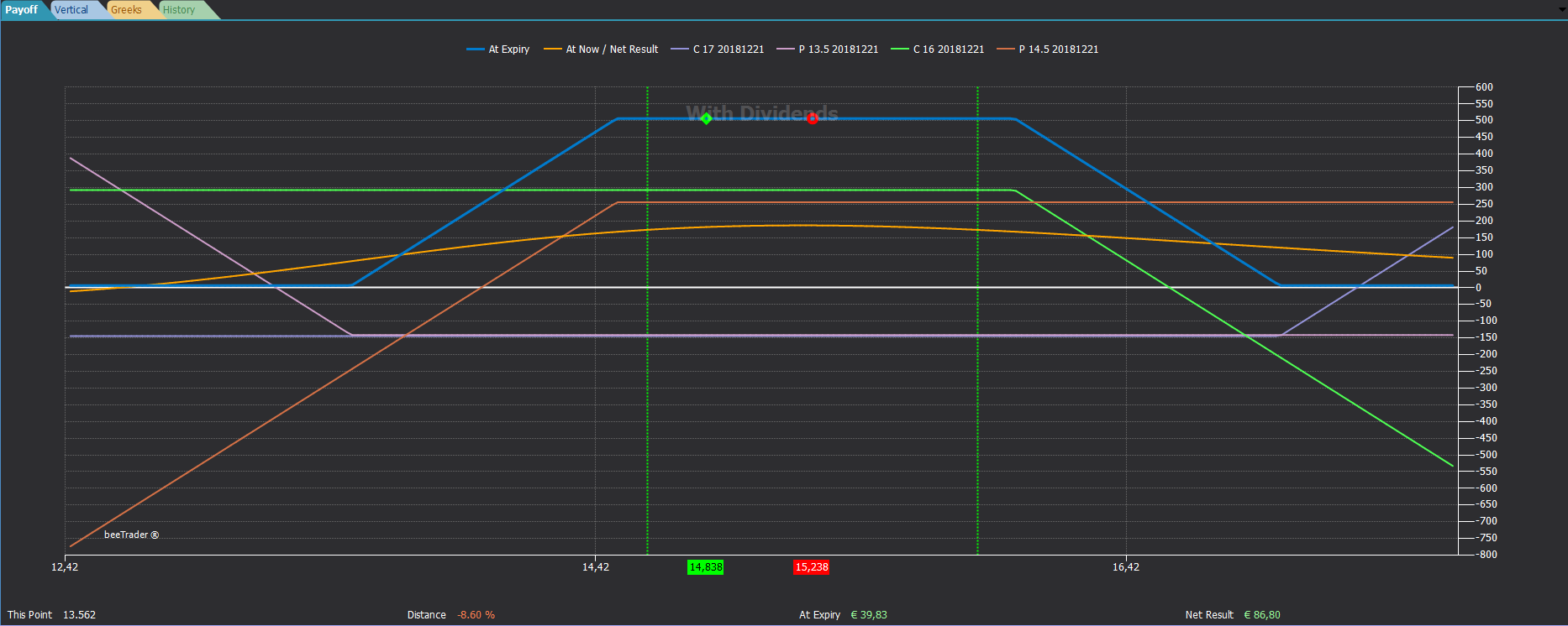
Vertical

In Vertical you have the possibility to see the payoff of the strategy crossed with the historical graph of the underlying. This display allows you to check the quality of the chosen strikes usually near supports or resistances.
Notice how the strategy payoff background is green, this is because the strategy represented is at positive risk, or the maximum loss is a positive value anyway, in the same way if the strategy should have a maximum negative profit the payoff will have the red color background.
Greeks

The Greeks view shows how the atnow (ie the current profit / loss) of every single leg that includes the strategy is composed, dividing it among the Greek ones.
For example, the Call 16 earns 187 euros in delta, 40 euros in theta, while it loses 427 euros in vega.
Both the atnow view (for legs to market) and the view realized are available so as to have the possibility to verify when the consolidated is to be attributed to each Greek.
In order for the values shown to be correct it is necessary that the dates, the prices of the executed and the value of the underlying at the time of the executed (present in the Trades section) correspond to the real ones.
History

As can be easily understood, the History tab shows the trend of the monetary values of the strategy over time. For the historical graph of the strategy to be complete it is necessary that the strategy is open (it is sufficient to be included in a portfolio open). With the right mouse click, you can choose the timeframe to view the graph.
There is also a display of the Greek history.
In order for the values represented to be correct it is necessary that the dates, the prices of the executed and the value of the underlying at the time of the executed (present in the Trades section) correspond to the real ones and that the strategy is open (or inserted in a portfolio open).
Open Interest

The Open Interest tab displays the options Open Interest distribution. The Open Interest represents the amount of contracts open to the market. There are different types of views and groupings, by Strike, by Expiry and Option Pain.
Read more at this link: Open Interest
Gamma Exposure

The Gamma Exposure tab displays the Gamma Exposure distribution grouped by strike price or expiration.
You can activate/deactivate the drawing of Gamma Calls, Gamma Puts, Net Gamma Exposure and Absolute Gamma Exposure by clicking on the corresponding items in the chart legend.
Read more at this link: Gamma Exposure
Term Structure

Yeld curve or term structure.
For Bonds:
Distribution of the effective yields of a set of bonds which are identical in all respects, except for their maturity, according to their residual life.
The yield curve (or term structure) expresses the relationship that exists between the yield of bonds and their maturity and is based on the comparison of a set of identical bonds in all respects except in the residual duration.
For assets having a future as underlying (FOP):
Options on futures are similar to options on stocks, but with one major exception…Futures are the underlying instrument off which the options are priced (unlike equity options which have the stock as its underlying). As a function of being priced off of futures, it’s important to be aware of the differences between futures options and equity options.
In fact, having different underlyings (futures), even the options that are quoted have their parity at different prices, prices that are given by the underlying future.
An example on CrudeOIl at theoretical prices:
imagine that the current spot price is $ 100 while that of futures with different maturities is 110 on the first, 120 on the second, 130 on the third. By combining these three points in the beeTrader chart we have a curve that we can then evaluate to get information on the contango (spot price lower than the forward price) or the bakwadrdations (spot price higher than the forward price).
These analyzes are fundamental for trading in both Spread Trading and Calendar Trading.
By clicking on the Term Structure button, a window will appear with the quotes of the futures that are automatically selected by beeTrader from all those listed and the consequent structure.

Only in case there are different trading classes, the user will have to select the desired trading class.
Charts settings

-
Preferred Expiry: in the case of a multi-expiration strategy, it allows you to choose the expiry date for the payoff;
-
At Expiry: view the payoff strategy of all orders (Paper Trading and Real Market);
-
At Now: view the line At Now;
-
Break-Even Points: displays two vertical lines at the break-even points of the strategy;
-
Standard Deviations: displays two vertical lines at the number of standard deviations chosen by the user calculated on the number of periods set in the line below. For more information on the Standard Deviations , click here ;
-
Periods: number of periods on which the Standard Deviations are calculated;
- Monte Carlo Simulation: displays the strategy’s PayOff, calculated as a result of the Montecarlo Simulations on 4000 runs. At the same time, again in the PayOff area, two vertical lines are drawn which represent the maximum underlying’s price exursion, positive and negative; Important: this simulation intercepts by default the nearest expiry date of the options that make up the strategy. If you want to change the setting values go to Strategy Settings -> remove -> Auto Detect and set the desired values BEING CAREFUL NOT TO EXCEED THE NEAREST EXPIRY DATE.
-
Underlying Excursion: enables the display of two vertical lines representing the Highest High and the Lowest Low of the underlying in the indicated period.
- Theor. Underlying Excursion: enables the display of two vertical lines representing a forecast of the underlying price excursion based on it’s historical volatility. The forecast length can be changed.
- Trigger Levels: The Trigger Levels are expected price levels calculated on the implied volatility of Call and Put Options with delta 25 with a maturity of 30 days rolling. More info at this link.
-
Legs: allows you to view the individual legs that make up the strategy, for a better view it is advisable to disable the At Now line;
-
Paper Trading (At Expiry): displays the payoff strategy only for orders registered in Paper Trading;
-
Real Market (At Expiry): displays the payoff of the strategy of only orders registered in Real Market;
-
Calendar with Entry Volatility: to be used in the case of Calendar strategies, it allows you to always use the volatility of the marketing of the strategy, in this way you force the payoff not to suffer the actual changes due to volatility
-
Greek: display the graph of the user’s Greek choice;
-
DPD Forecast Map: displays a predictive map on the underlying price at maturity calculated with the algorithm of Defense Point Distribution . The time horizon of the DPD Forecast Map is calculated on the shorter of the options in the Strategy. If there are no options in the Strategy, it is calculated at 10 days. It can be considered as a curve indicating the probability of where the price of the underlying can be found for the expiry of the options considering the number and size of DPD barriers placed on various strikes;
-
Info Bar: displays the bottom bar with the main information of the strategy. It’s possible to choose what to display between two pairs of additional informations: At Expiry / Un-Realized values or Historical Probability / Total Exercise Quantity. Historical Probability is computed on a period of 500 daily bars.
- Overlay: allows to select what to plot overlied to the underlying historical chart in the Vertical tab. Available selections are: None, DPD (Defense Point Distribution) and Open Interest.

In the Colors tab there are all the color settings: both those common to all charts, and the specific ones that for convenience are divided according to which chart has them in use.