
Options Portfolio – Charts
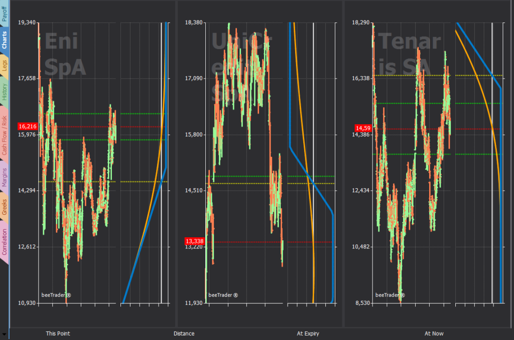
The charts section allows the visualization of all the strategies contained in the portfolio. The display is made with the historical graph of the underlying and the cross payoff. In this way you can have an immediate view of your position.
-
Red Line: represents the price of the underlying;
-
Yellow Lines: represent the Breakeven Points;
-
Green Line: represent the Standard Deviations with the same parameters as the vertical graph of the strategy.